Technical Report Writing
CHAPTER
7 Graphical Report Elements
A.
Chapter Summary
In this, and in Chapter 9, the parts
of your report which make the first, and often most telling, visual impression
are described. The use of white space to guide the reader's eye and maps, graphs,
schematics, tables and other illustrations all contribute to, and sometimes
determine, the overall effectiveness of the report.
B. White Space
The reader of your report will find
it much easier if you provide an occasional rest from his/her labors. The effective
use of "white space" does this and makes your report look better,
scan more easily and places the emphasis on the most important points. Look
at other reports you've seen where the authors have done this and you'll see
how spacing things properly can increase the effect of the message.
C.
Maps and Aerial Photographs
Maps are an integral part of many reports
in the Civil Engineering field as in many others. A good readable map answers
the first question many readers have which is, where in the world is this project?
By contrast, find a report in your own organization which does not have good
maps. There are many such reports around so it won't be difficult to find an
example.
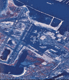
Aerial photographs and mapping products
derived from them are attention grabbers! The three examples below are good
examples.

Figure 7-1a
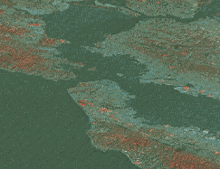
Figure 7-1b
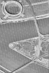
Figure 7-1c
What is the effect of such a report
on you, the reader? Do you find yourself annoyed and frustrated because you
can't read the maps? Are they so poor that you can't even tell what it is they
are trying to show? Are you angry at the author of that report because he didn't
take the time and trouble to reproduce a good map at an appropriate scale to
illustrate his ideas?
There are several examples of maps included
in this Chapter. Look at the Figures below. They have been chosen because they
represent what good maps can and should be.
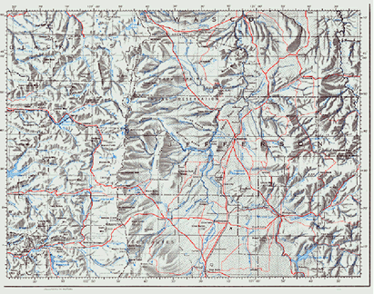
Figure 7-2a
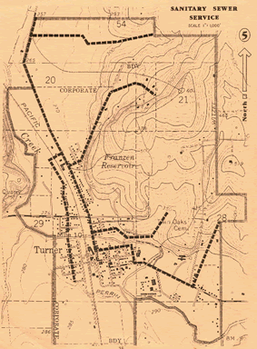
Figure 7-2b
There are many others examples around
and you should be able to find some in your own library. They all share some
characteristics in common, including;
·
A North Arrow
·
An Appropriate Scale
·
Usually a Graphic Scale
·
Often, a Screened Back Background
·
Frequently, Color to Highlight Important
Features
·
A Legend
·
A Common Base Map to Permit Easy Comparison
The increasing use of Computer Aided
Design and Drafting (CADD) and Geographic Information Systems (GIS) is making
production of such maps easier and easier. If you have access to such systems,
use them to produce the kind of maps that clarify your ideas and win your reader's
appreciation and support for those ideas.
D. Graphs
Graphs represent one of the best ways to illustrate numerical data in a concise and dramatic way. The example below is offered to show how this is accomplished. Graphs are especially helpful when you wish to show trends over time or the effect of one variable upon another. The key to good graphs however is simplicity.
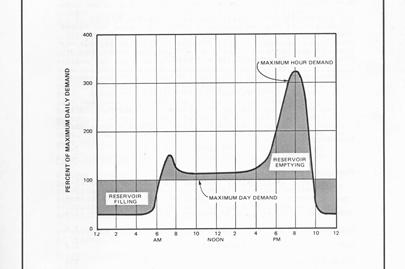
Figure 7-3
Some of the pitfalls in creating and integrating graphs into your report arise
from failing to remember to keep graphs as simple as possible. Trying to show
too many things on a graph is worse than not graphing the data at all. A graph
with too many lines, especially when they cross and/or relate to different scales
tends to confuse your reader and distort the data.
Suppressed zeros are another way to
distort data. Most readers expect to read graphs from left to right and from
the bottom up. When you depart from these conventions, the reader may get confused.
It may occasionally be necessary to do so, but be sure to explain fully in your
report why the data is plotted in this non-conventional way.
The type of graph; bar, line, pie, area,
3-D, logarithmic, etc., is also important. Complicated but unusual graphs can
be very helpful to you in your technical investigations but need to be used
with great caution in your report. Consider again your audience. Will they understand
this log/log plot of variable a vs. variables b,c,d,e and f? If not, include
this graph in an appendix intended for your technically inclined readers and
find a way to summarize the conclusions you've drawn from this graph in the
main body of your report.
E.
Schematics, Flow Diagrams
A very powerful tool for conveying technical ideas is the "schematic diagram". As used here, this term means a drawing or illustration which shows how something works, rather than how it actually looks. An example can be seen below.
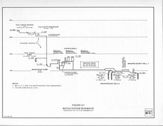
Figure 7-4
Think of these as "idea-grams". They are meant to explain fairly complex
systems in the simplest terms the author can devise. Flow diagrams are similar.
They show how something flows through the system, what happens to it along the
way and what the end result of a process is. The water treatment flow diagram
is good and well drafted. It could be improved however by rendering the main
flow, the flow of water through the system, in a heavier line weight. The other
flow paths, such as the chlorine feed lines, are less important and need to
be suppressed.
F. Tables and Highlighting the Important
Stuff
Tables represent a kind of hybrid between textual and graphical report elements. They are very important though and need a little thought and attention to detail in their design. Very simple tables, such as in the example below, do not require much explanation in the text of the report but more complicated tables, do. As a concise way of presenting data though, a table is hard to beat.
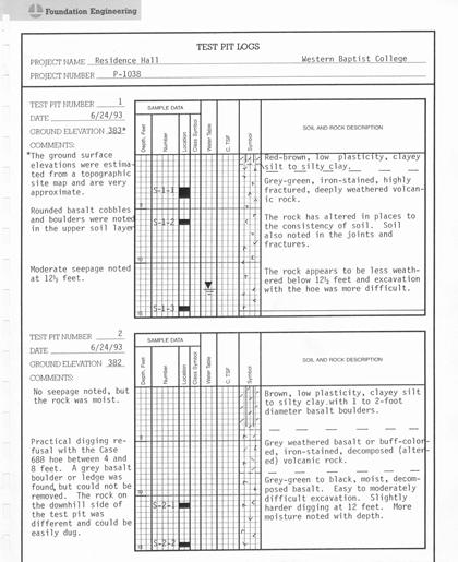
Figure 7-5
They also have an advantage to you as
technical writer. With a good tabulation of data, your job is to explain in
the text of the report the meaning and significance of the table.
Certain features of tables can add greatly
to their impact. Lines are very helpful in guiding the reader's eye to those
things you particularly want him/her to notice. Shading, boldface type, separation
and similar tricks can also be used to accomplish that same objective.
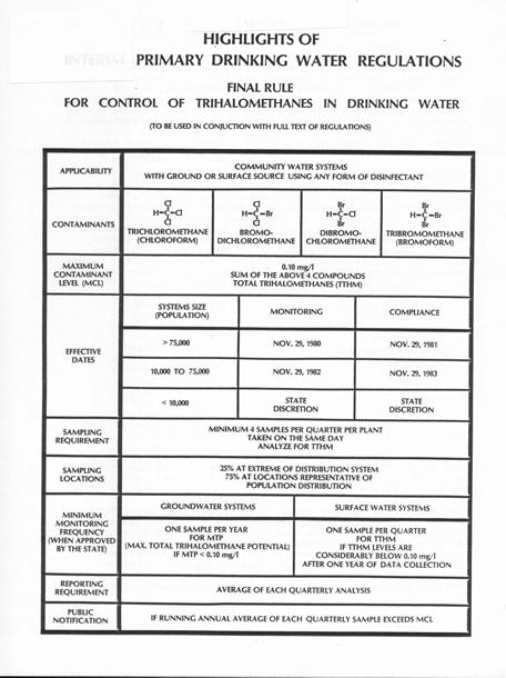
Figure 7-6
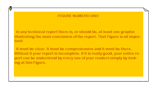
In all graphical elements of your report
it is essential that you avoid clutter, confusion, business and sloppiness.
These things interfere with your main goal which is communication. Do this
by being careful about where you place labels in graphs, titles in tables,
notes appended to either and reference marks or ticks.
H. Color, Line Weight and Style
These features of the graphical elements
of your report are important little details which often spell the difference
between an effective illustration and one that only confuses or obscures your
message. Some people naturally have an eye for this sort of thing while others
do not. If you are one of the latter, the best advice that can be offered
is to find someone in your organization who does and seek their advice.
I. Linking Text and Graphics
It is common for a technical report
to be built around the graphical elements within it. This technique is used
by many good technical writers and they have devised ways to link the graphics
to the text. Phrases and formulas for doing this may be found in parts of
this syllabus, as examples. However you do this, don't forget that it is essential.
Without this kind of "connective tissue" your report will be a skeleton
from which the muscles have become detached.
J. Numbering Figures & Graphs
At the end of Chapter 6 the suggestion
was made that Figure numbers follow the Chapter or Section numbering scheme
of your report. It is nice, but not essential, that Figure numbers be consecutive
starting with, for example, Figure 4-1 and proceeding by ones through Figure
4-X. If you can, do this. But if you can't, don't worry about it. The only
essential thing is that each Figure or Graph or Table have a unique number
so that your references to it in the report will be unambiguous.
K.
Summing Up
The graphic elements of your report
are important for at least the following reasons:
·
They are often the only thing which
will be looked at by some readers.
·
They create the overall impression of
the quality of your work.
·
They allow you to convey complex ideas
in simple ways.
· They are often the most concise way to present certain kinds of data.
****
****