Technical Report Writing
Chapter
9 Appearance Elements
A.
Chapter Summary
How your report looks often determines
whether or not it is read and acted upon in the way that you intended. A simple,
but inviting, cover will give your report a chance of achieving its purpose.
It cannot substitute for good technical work or competent writing but without
a reasonably presentable face on it, your report may not even get read.
B. A Matter of Taste
The Latin phrase has it; de gustibus
non est disputandum, there is no disputing matters of taste. What may appear
attractive to you may not to me, obviously. In technical report writing however,
you and I do not matter nearly so much as our audience. Consider, as you decide
questions of style and appearance, what their likes and dislikes probably are.
Again, you'll be guessing, but if you follow some basic principles of design
and keep it simple you are not likely to go very far astray.
C. Simpler is Usually Better
One of those principles is that simpler
is almost always better. Logos present an excellent example of this principle.
They are nearly always simplifications of some idea, picture or often letters
of the alphabet. Think of some of the better known corporate and sports logos
(below); IBM, 3M, Chrysler, the Pittsburgh Steelers, the Minnesota Twins, the
Cubs, the Seahawks, the Iowa State Hawkeyes ..... All are simple, eye-catching,
bold and repeated again and again in everything related to their owners.

Figure 9-1a

Figure 9-1b

Figure 9-1c
D.
Format Standardization
Organizations which produce many reports
find it very useful to standardize report formats. This has several advantages
including simplifying the report writing process and allowing the organization's
work products to look consistently good. This is done by both large and small
organizations both in the public sector and in private consulting work.
The best part of this is that it is
not very difficult to do. Simply select from among your existing reports several
that look good and adopt the best features from each. Try to keep it simple
and let it be a useful checklist. The title page is a good place to start. This
standard format also serves to remind the writer to include certain essential
information while at the same time contributing to the appearance of the report.
E. Covers, Bindings, Color and Logos
The first thing your potential audience
sees of your report is the cover. Make that first impression count. Make it
attractive and invite the reader to open it to see what's inside.
Bindings, such as wire spiral bindings,
which allow the report to be opened and lay flat are very desirable. They are
expensive but if your report is one which is likely to be used again and again
by your readers, they may be worth that extra cost. Some reports are designed
from the beginning to be amended and updated frequently. For these, three ring
view binders are often the best choice. Whatever you choose, think of how your
report will be used by your target audience and then select the best binding
you can afford.
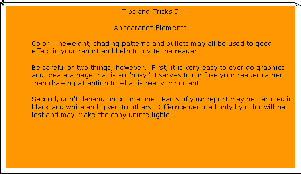
Color is also expensive but becoming
less so with the improvements in color copying technology. Use color sparingly
in technical reports however. Not only is it expensive but it creates a few
problems you need to think about ahead of time. Never rely on color alone to
convey your message. If, for example, you want to depict six different land
use categories on a map in color, also use six different shading patterns. In
this way you can make black and white copies of the map cheaply and not lose
the information by doing so.
A very useful thing to know about your
primary audience is whether or not they have such a symbol of their identity.
If so, use it in your report which is, after all, written for them. It makes
your report "customized" and identifies your client audience as the
important part of the process that they are. It makes them feel good and appreciated
and lets them know that this report was written for them, not for just anyone.
F.
Tabs and Dividers
Longer reports require that division
into smaller segments to avoid a lot of page flipping to find specific information.
Tabs and dividers are very useful here and should be part of most of your lengthier
reports. Labeling, or at least numbering, the tabs is highly advised.
G.
Large Format Maps and Figures
When Figures or maps get larger than
11" x 17" you'll need to find some way to incorporate them into the
report other than binding them. A map pocket inside the back cover works very
well for this if only one or two such Figures are needed. If a larger number
are needed you may have to go to a separately bound volume with an oversized
cover, etc. This is to be avoided if possible because of both the cost and time
involved. But if you must, do it. The information those Figures contain may
be essential to your reader and you must make it a accessible to him/her as
possible.
H. Fancy Fonts
Desktop publishing programs are wonderful
but they do tend to allow some of us to get carried away. The number and variety
of styles, sizes and shadings possible may tempt you to try them all in one
document. Resist that temptation. Two or three sizes and, at most, two styles
of font are about all that are really needed to produce a good looking technical
report. Try to select styles that are easy to read. Try them out within your
organization if you can. You can print out a sample page from the report using
the fonts you think you'll use and ask 3 to 10 people to read it and tell you
how they like each.
I. Costs
Making a report look good does cost
something but it need not be overwhelmingly expensive. While you need to consider
these costs remember that they are usually only a small part of the total project
budget. An ugly report costs something too. If it loses your primary audience
because they are turned off by its appearance then the money you saved on cheap
covers, sloppy bindings, and illegible maps is money thrown away.
J.
Time = $$$
Whether you work in a public agency
or in the private sector, time is always money. This syllabus is filled with
many tips for saving time, in the long run. The suggestions on standardization,
cloning, customized tab sets, covers, etc. will all do that. Your job may not
primarily be to produce reports but if report writing is any significant part
of your job, use these suggestions to save time later. When the deadline looms
on the horizon, you won't have the time to spend setting these things up.
K.
Summing Up
The perfect technical report has never
been written but some excellent examples exist. Whatever their content, those
best examples "look good". If they don't it is not likely any of us
would run across them. A little planning and attention to detail at the beginning
of the report writing process will pay off at the end by resulting in a report
someone will want to open and read.
L.
Custom Report Covers and Tab Sets.
Even the most mundane report can be
made to look better and easier to read. A customized cover which invites the
reader's attention and tells him/her quickly what this report is about is the
front door to your house of communication.
Labeled, tab dividers segment your report into useful pieces. They are the doorways to the rooms of that house and they make the floor plan clear to your reader.
****

****